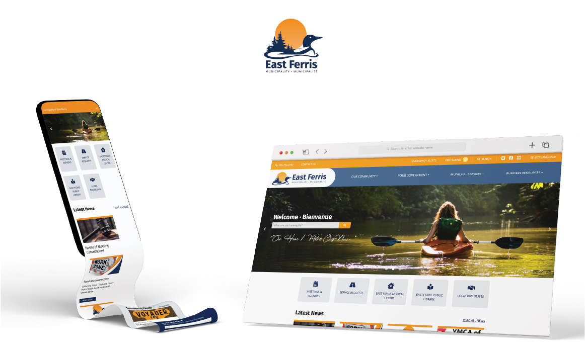
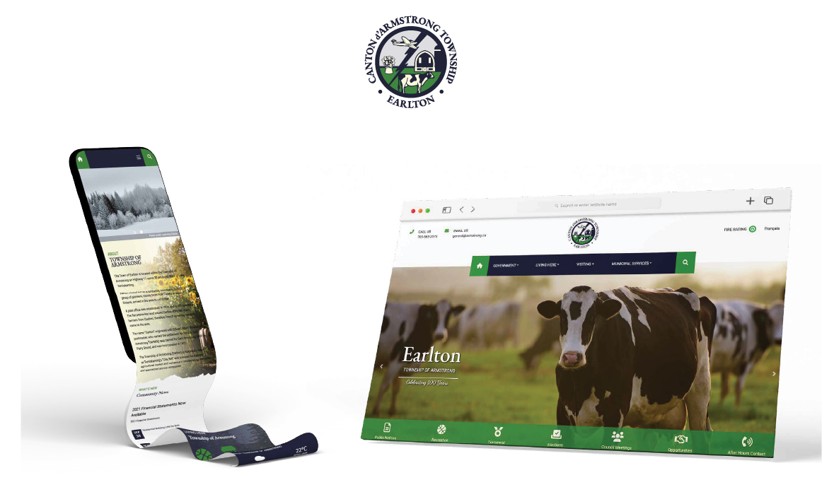
Municipality of East Ferris
CLIENT
Municipality of East Ferris
PROJECT
Branding
TIMEFRAME
2020
SCOPE OF SERVICE
Branding, Graphic Design, Logistics and Tactical Planning.
SCOPE OF WORK
The project encompasses the development and refinement of the Municipality of East Ferris’ corporate identity. It entails revisiting the brand’s historical evolution, from its inception rooted in township names to its present representation. The formation of the visual identity, including logos and key symbols, forms a significant part of this scope. The project also delves into the broader context of how this identity resonates with citizens and stakeholders. Recommendations and actions for enhancing and maintaining the brand are identified through consultation with both public and stakeholders.
OBJECTIVE
The objective of this initiative is to enhance the visual identity of the Municipality of East Ferris, ensuring it effectively communicates with its diverse audience. This involves revisiting the existing logo and symbols that represent the Municipality, with a focus on aligning them with the contemporary values, aspirations, and activities of the community. Through public engagement, insights, and collaborations, the objective is to evolve the visual identity to mirror the Municipality’s current essence and its unique offerings. The aim is to create a consistent and resonant identity that fosters recognition, pride, and engagement among citizens while reflecting East Ferris’ story.
OUTCOME
The project culminates in a reinvigorated corporate identity for the Municipality of East Ferris. Drawing from the narrative of East Ferris, specific symbols have been thoughtfully chosen to integrate into the brand identity and logo. A common loon over water symbolizes the Municipality's reverence for its natural environment, echoing the health of Trout Lake and Lake Nosbonsing. The rising sun captures East Ferris’ commitment to balance tradition and progress. Trees symbolize resilience and leadership, harking back to the origins of Astorville and Corbeil as logging communities. The color palette mirrors East Ferris’ cultural diversity, seasonal changes, and scenic landscapes. This outcome unifies the community, evoking pride, recognition, and a renewed narrative that extends East Ferris' story to the world.
VIEW LIVE WEBSITE